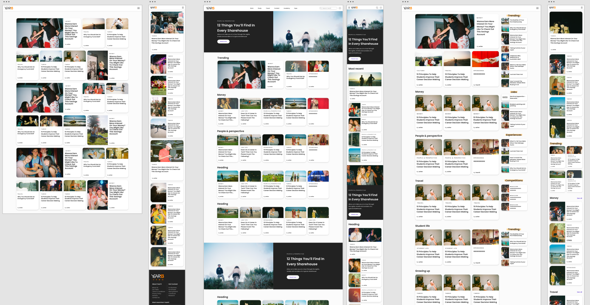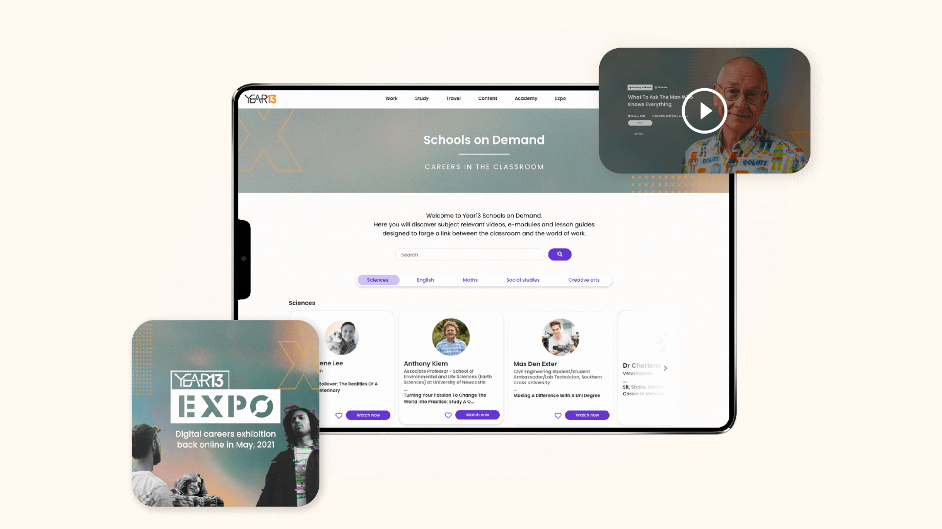
Year13 Homepage and navigation
The Year13 website has continuously updated and changed throughout the years. We re-designed the homepage at the end of 2022 to facilitate our new vertical categories and drive engagement to articles. We also updated the navigation so young people could locate the different vertical categories easily and discover the specific advice they were looking for.
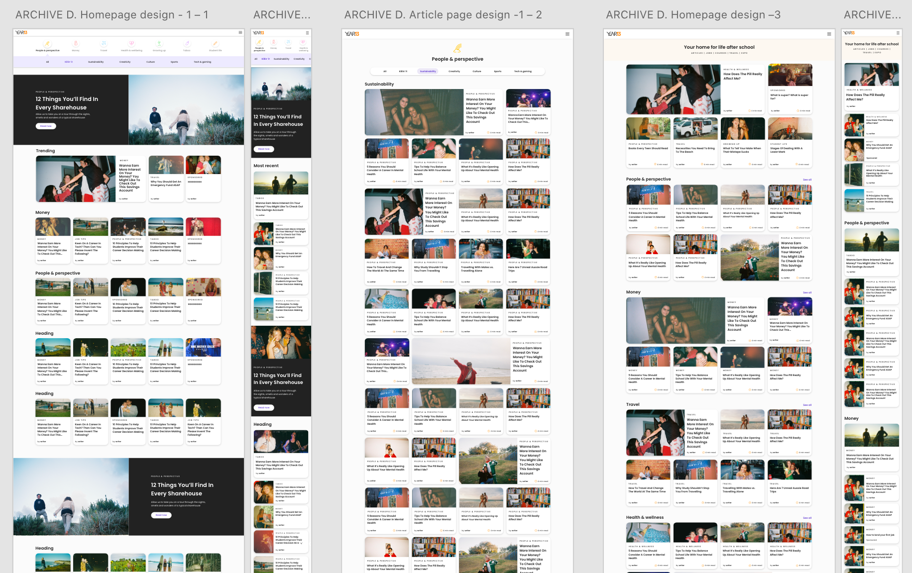
Vertical Page templates and article design
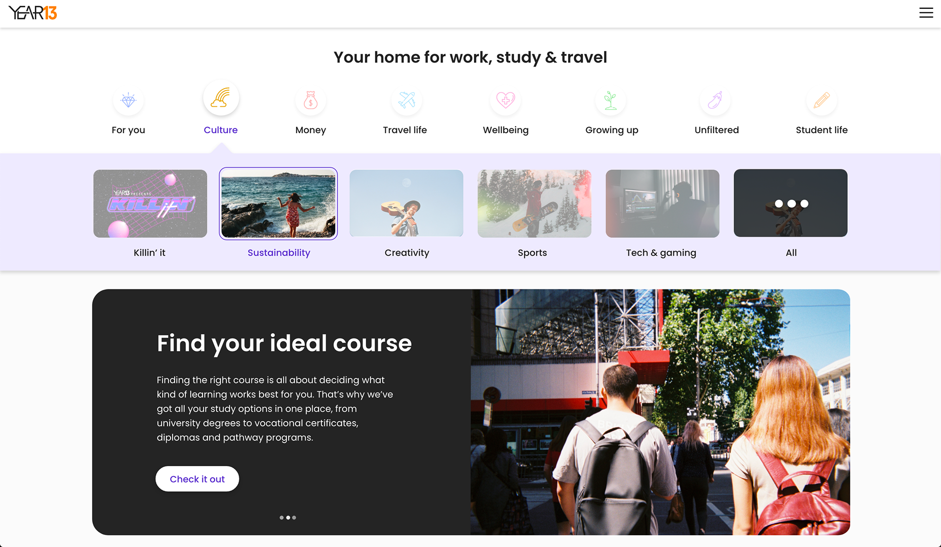
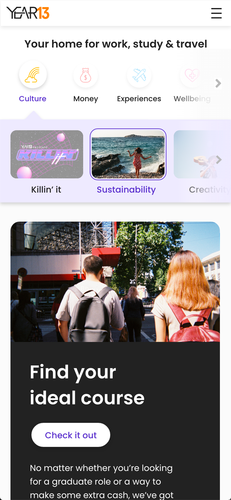
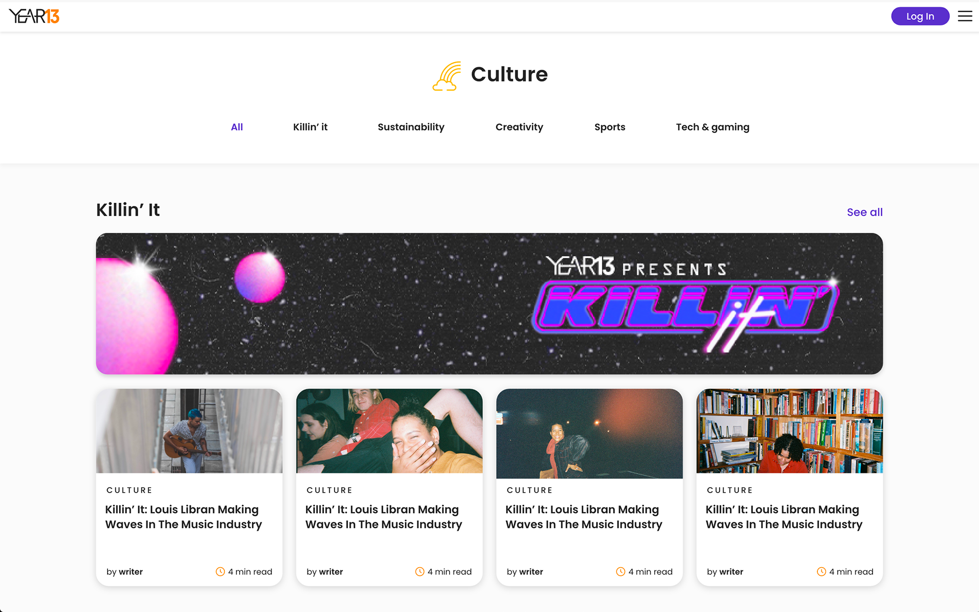
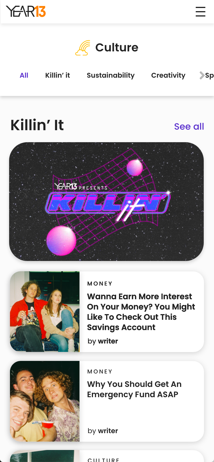
The content team at Year13 separated their articles under new vertical titles that helped organise the content to be more relevant and easier to navigate for young people. For the homepage, in collaboration with the graphic designer we created branded cover images for the vertical sections to help visually separate the page. The goal was to trial a new more graphic way to advertise the articles and drive traffic. Three months after launching, there was a 20% increase in website traffic and longer average user sessions on the homepage.

Year13 Navigation
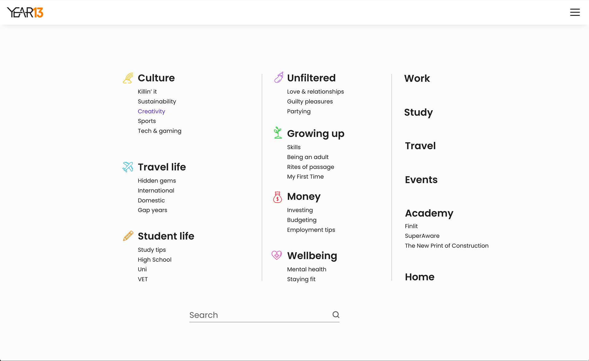
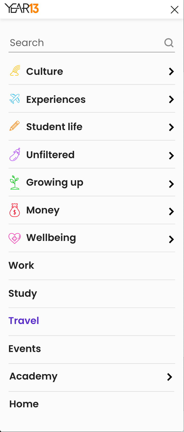
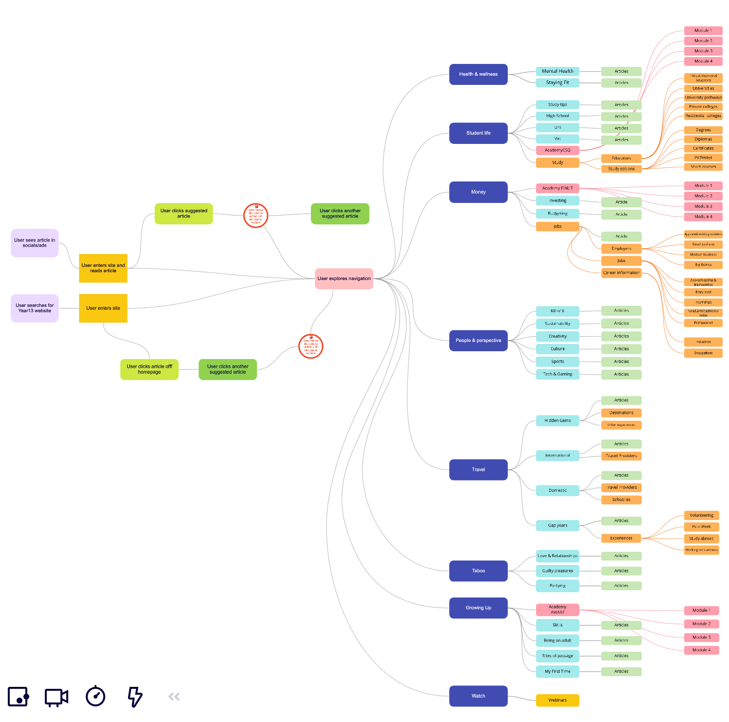
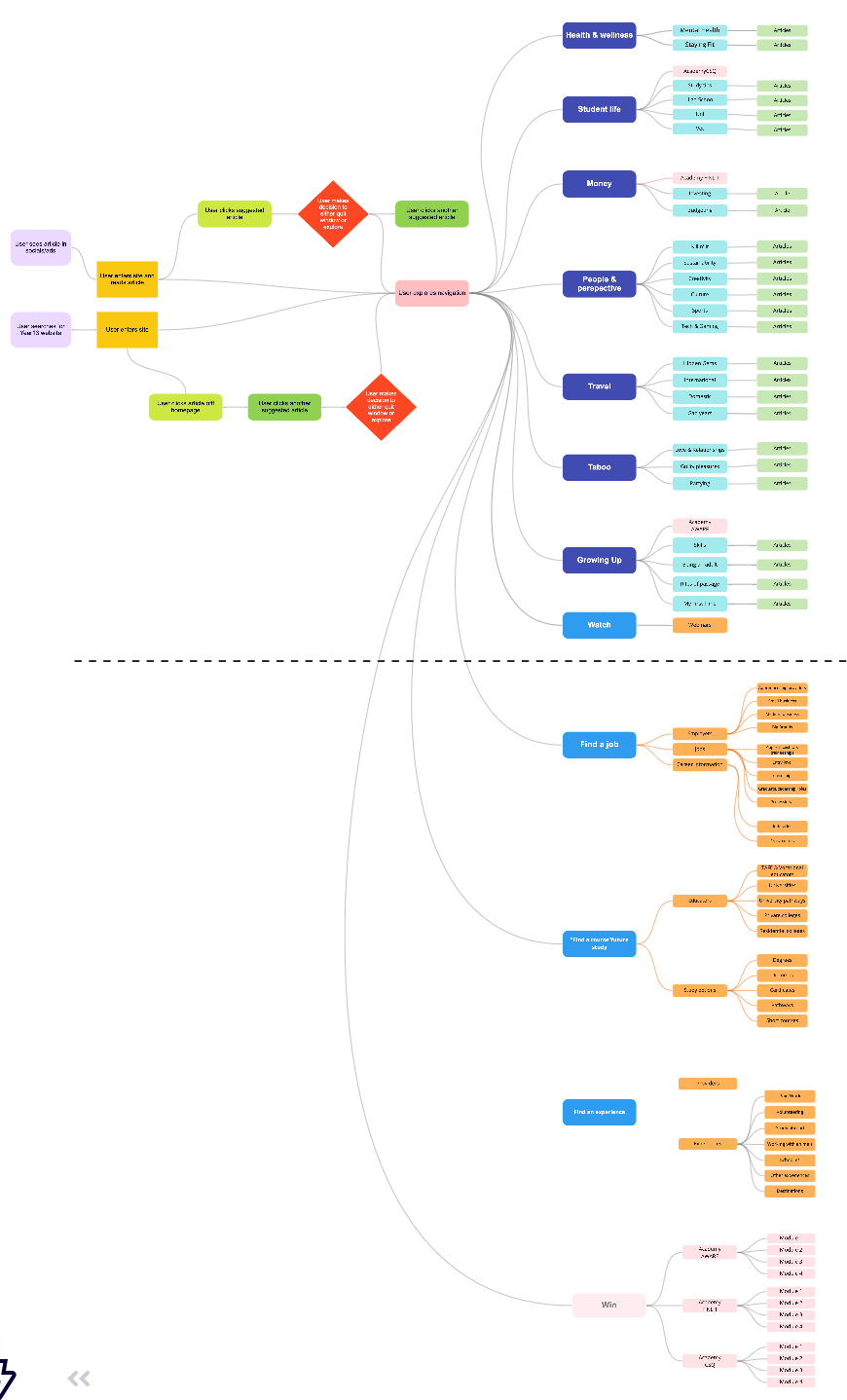
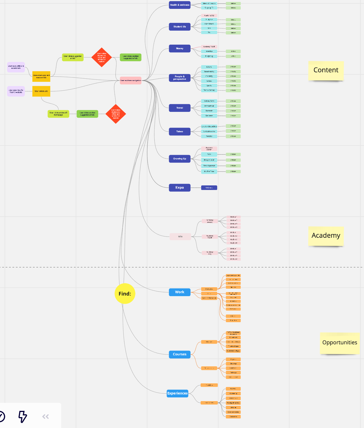
The marketing team initiative was to try to drive more traffic to the website through the new article verticles, advertised both on the home , socials and emails. However, they also wanted to work with the Product team and trial the effect of re-structuring the navigation on the Year13 website to highlight these verticals and give them more emphasis. This change was also made to start understanding which themes our audience (teenagers > recent graduates), most gravitated towards and we could use this data to help build more content and e-learning modules.

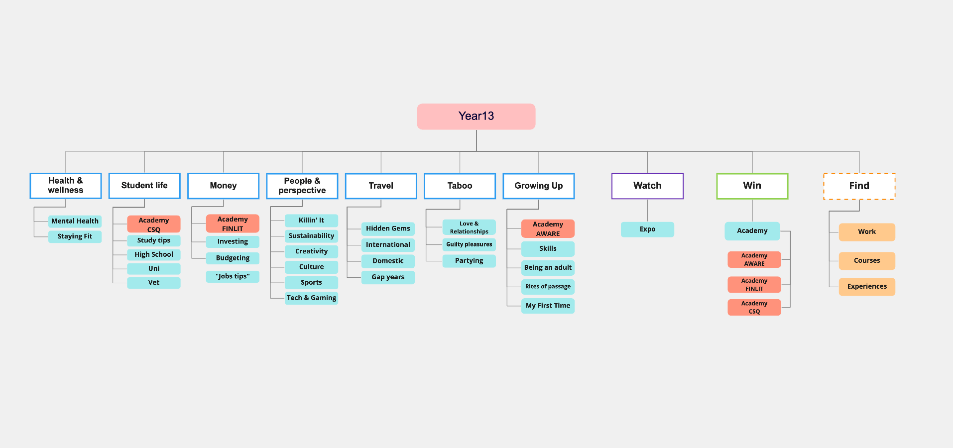
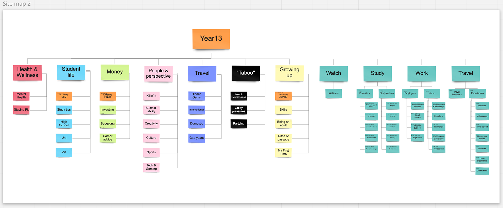
Research
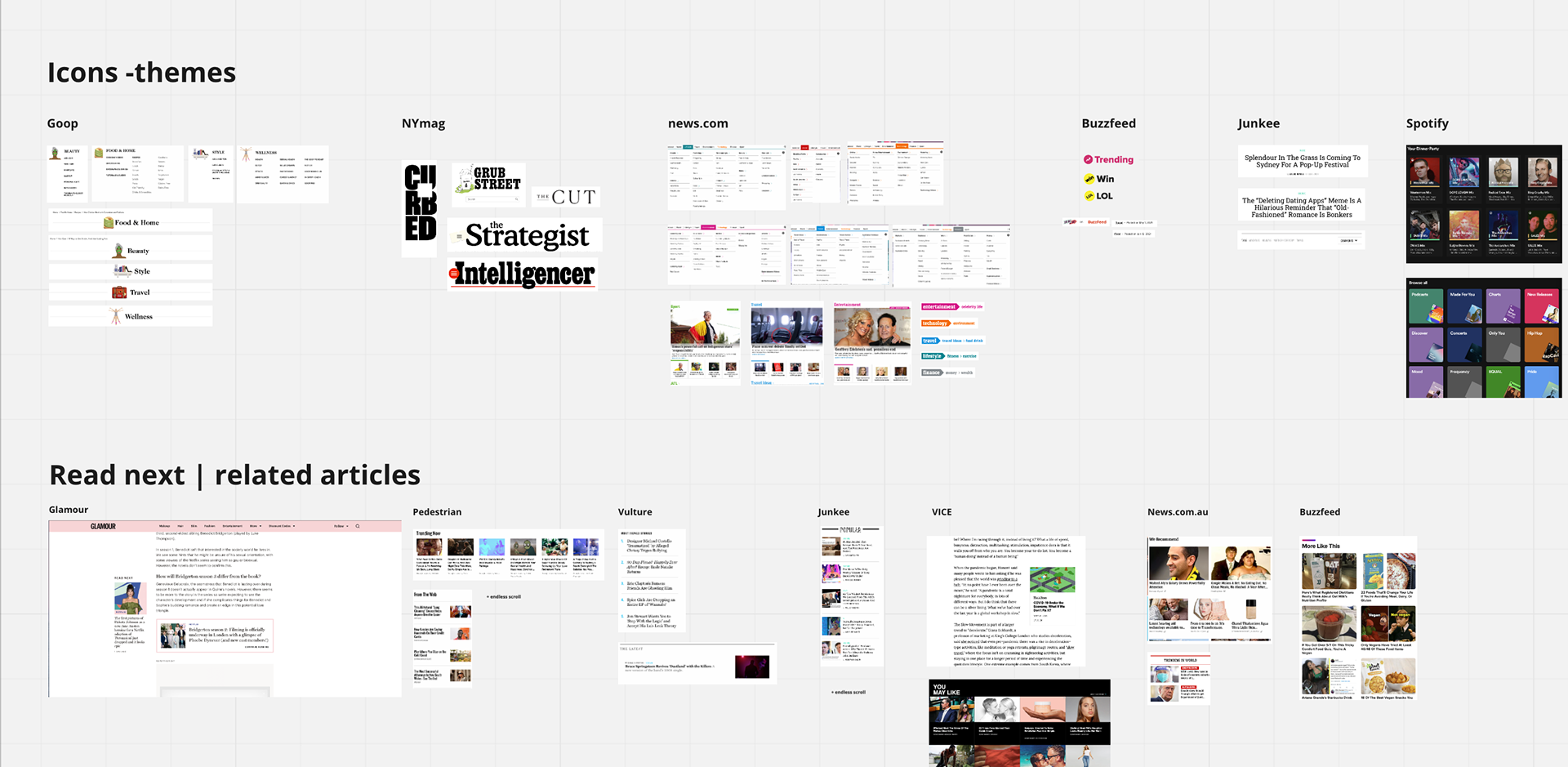

I conducted an extensive series of user mapping exercises for the website to strategically integrate the six new verticals into the site map and navigation. Given Year13's diverse array of digital product tools, it was crucial to ensure that each journey to the vertical or product page was clear, avoiding confusion and maintaining a familiar path for users accustomed to engaging with similar content websites. To prevent content overload, we opted to separate the verticals from the digital tools, avoiding the amalgamation of articles with distinct functions that users might not anticipate. Several user journey maps were crafted based on different site map variations, assessing which flow offered minimal tension and the most seamless experience for users.
Exploration design of different layouts and structure of the vertical pages